

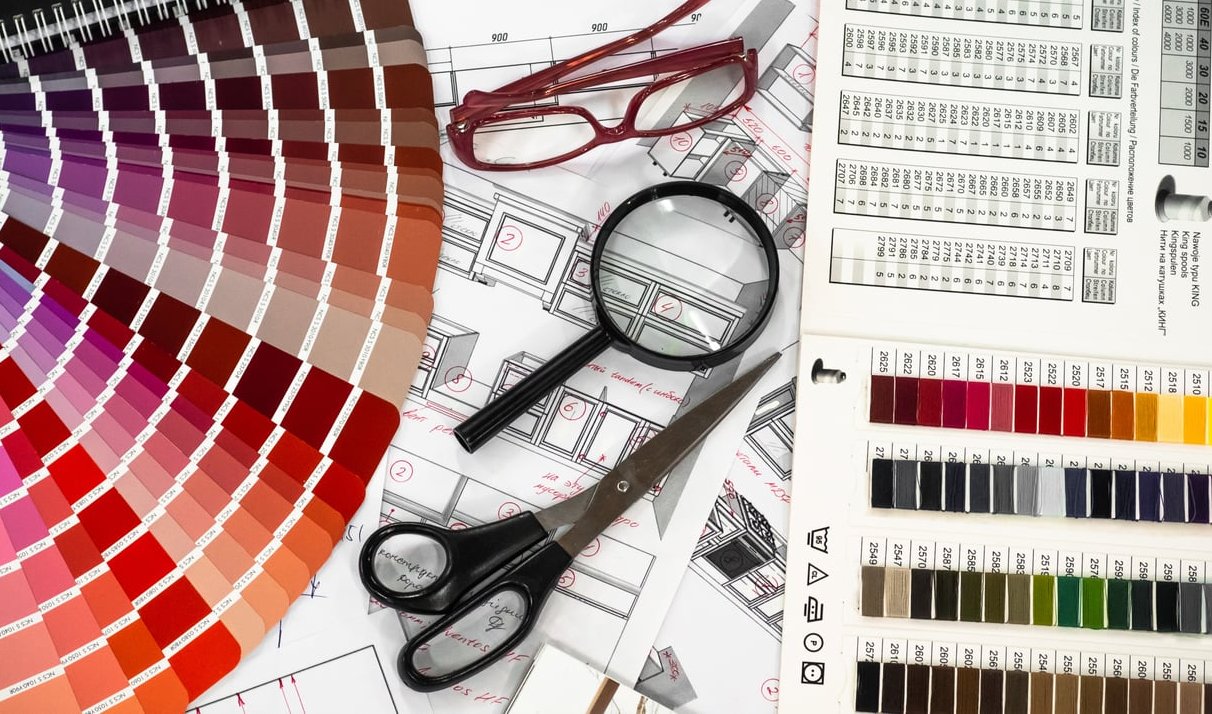
Choosing the right font pairing for social media is one of those design decisions that looks small but changes everything. A great combination makes your post stop the scroll. A poor one makes followers swipe past without even reading your message. At Zigrino Visual, we design hundreds of social assets every month for clients across industries, and we have noticed something most font pairing guides ignore: a combination that looks stunning on a desktop mockup often falls apart on a 6 inch phone screen.
This guide is different. We are walking you through 12 font combinations that genuinely perform on Instagram, LinkedIn and TikTok, organized by industry and tone, with practical notes on mobile readability and how to keep your brand consistent across platforms.
Why Font Pairing Matters More on Social Media Than Anywhere Else
On a website, users have time. They scroll, they read, they pause. On social media, you have roughly 1.5 seconds to communicate your message before the thumb keeps moving. Your fonts are doing the heavy lifting, and they need to do it at small sizes, with motion, and across very different feeds.
Three principles guide every pairing we recommend:
- Contrast: the display font and the body font should feel clearly different in weight, proportion or style.
- Mobile legibility: body text should remain readable at 14 to 16 px on a phone.
- Brand consistency: the same pair should adapt across square Instagram posts, vertical TikTok captions and horizontal LinkedIn carousels.
The 12 Font Pairings That Actually Work
1. Playfair Display + Inter (Luxury, Beauty, Editorial)
The Playfair italic still rules elegant beauty content. Pair it with Inter for captions and small text. Inter holds up beautifully on Instagram Stories at 14 px.
Best for: skincare brands, boutique hotels, fashion editors.
2. Bebas Neue + Open Sans (Fitness, Sports, Energy)
Bebas Neue is the workhorse of high impact headlines. It compresses well on TikTok where vertical real estate matters. Open Sans keeps your supporting text neutral.
Best for: gyms, athletic brands, motivational creators.
3. Fraunces + Manrope (Tech that Wants to Feel Human)
Fraunces brings personality with its soft serifs while Manrope keeps everything modern. This pair works exceptionally well on LinkedIn carousels.
Best for: SaaS startups, B2B agencies, founder content.
4. Archivo Black + Archivo (Bold Statements, One Family)
Using one type family in two weights is the safest brand consistent choice. Archivo Black for shouting, regular Archivo for explaining.
Best for: news brands, podcasts, media outlets.
5. DM Serif Display + DM Sans (Premium and Minimal)
Designed to work together, this Google Fonts pair offers refined contrast without conflict. Tested at 12 px and still readable.
Best for: consultants, financial advisors, premium service brands.
6. Anton + Roboto (TikTok Captions That Pop)
Anton is built for TikTok. Its tall narrow shapes survive video compression and small thumbnails. Roboto handles your descriptions cleanly.
Best for: creators, food content, viral storytelling.
7. Cormorant Garamond + Lato (Wedding, Lifestyle, Slow Brands)
Cormorant whispers elegance. Lato keeps it readable. Avoid using Cormorant below 18 px on mobile, it loses its character.
Best for: wedding planners, florists, lifestyle bloggers.
8. Space Grotesk + IBM Plex Sans (Modern Tech)
Space Grotesk feels current without being trendy. Pair it with IBM Plex Sans for a clean, engineering forward identity.
Best for: developer tools, AI products, fintech.
9. Recoleta + Nunito (Friendly and Approachable)
Recoleta has that rounded warmth that performs well in pastel feeds. Nunito complements it without competing.
Best for: parenting brands, education, wellness apps.
10. Montserrat + Merriweather (Reverse Pairing for LinkedIn)
Most pairings put the serif on top. Flip it: Montserrat headline, Merriweather as supporting quote text. It feels editorial and authoritative on LinkedIn carousels.
Best for: thought leaders, B2B writers, coaches.
11. Syne + Work Sans (Creative Agencies)
Syne has just enough quirk to feel custom while Work Sans grounds it. Excellent for portfolio reveals and agency content.
Best for: design studios, creative directors, art events.
12. Oswald + Source Sans 3 (News and Information Heavy)
Source Sans 3 was updated specifically for screen readability. Combined with Oswald headlines, it handles dense LinkedIn posts and Instagram infographics with ease.
Best for: journalists, analysts, data driven creators.
Quick Reference Table by Platform
| Platform | Best Pairing | Why |
|---|---|---|
| Instagram Feed | DM Serif Display + DM Sans | Square format, premium feel, scales down well |
| Instagram Stories | Playfair Display + Inter | Vertical attention, elegant impact |
| LinkedIn Carousel | Fraunces + Manrope | Professional but human, holds long text |
| TikTok Captions | Anton + Roboto | Survives compression, vertical optimized |
| Reels and Shorts | Bebas Neue + Open Sans | High contrast, motion friendly |
The Mobile Readability Test We Use at Zigrino Visual
Before we approve any font pairing for a client, we run it through this checklist:
- Export the design at the actual platform size (1080 x 1080 for IG feed, 1080 x 1920 for Stories and TikTok).
- View it on a mid range phone, not your designer monitor.
- Check at 50 percent brightness in a sunny environment.
- Scroll past it quickly to simulate real user behavior.
- Ask someone outside the project to read the headline aloud.
If any step fails, the pairing is not ready.
Keeping Brand Consistency Across Platforms
One of the biggest mistakes brands make is using different fonts on each platform. A consistent visual identity is what turns a follower into a customer. Here is how to maintain consistency without making everything look identical:
- Lock in your pairing at the brand level, not the campaign level.
- Adapt sizes per platform, not the fonts themselves. Bigger and bolder on TikTok, more refined on LinkedIn.
- Use weight variations within the same family before introducing a third font.
- Document your rules in a one page brand sheet your team can reference.
Common Font Pairing Mistakes to Avoid
- Pairing two display fonts. Always combine one expressive font with one neutral one.
- Using fonts that are too similar. Without contrast, the hierarchy collapses.
- Ignoring x height. Two fonts can have the same point size and look completely different in real reading.
- Forgetting accessibility. Light gray text on white might look elegant but fails contrast standards.
- Choosing fonts that lack weights. You need at least regular, medium and bold to build a system.
FAQ
How many fonts should I use for social media graphics?
Two is the sweet spot. One display font for headlines, one body font for everything else. Three is acceptable only if the third is a clearly different style used sparingly for accents.
Are Google Fonts good enough for professional brands?
Absolutely. Google Fonts has invested heavily in quality, and many of the pairings we recommend above are 100 percent free. The technical quality matches premium foundries for most use cases.
What font size should I use for Instagram captions inside graphics?
For body text inside image graphics, do not go below 28 to 32 px in your design file (which renders around 14 to 16 px on a phone). For headlines, 60 to 90 px works well on a 1080 x 1080 canvas.
Should TikTok use different fonts than Instagram?
Use the same brand fonts but adjust weights and sizes. TikTok rewards bigger, bolder type because of motion and vertical viewing. Instagram allows for more refined sizing.
How do I test if my font pairing works on mobile?
Export your design at full platform resolution, AirDrop or send it to your phone, and view it both indoors and outdoors. If your headline is unreadable in sunlight or your body copy strains your eyes, redesign before publishing.
Final Thoughts
Great font pairing for social media is not about following trends. It is about building a recognizable system that works at the speed your audience scrolls. Pick one of the 12 combinations above based on your industry and tone, run it through the mobile readability test, and commit to it across every platform.
If you need help building a complete visual identity that performs on social media, our team at Zigrino Visual designs brand systems specifically for the way people consume content today. Get in touch and we will help you find the pairing that fits your story.